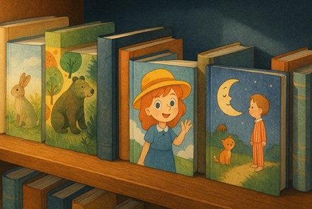
Don’t you think a picture tells half the story?
Especially, children’s books. Children don’t just read books; they see them. Before they can sound out a single word, they’re already interpreting emotions, colors, and faces on the page.
That’s a children's book illustration playing its part. It teaches empathy, imagination, and storytelling long before literacy begins.
Think about it: a child may forget the words “The Very Hungry Caterpillar,” but they’ll remember that green, hole-punched caterpillar crawling across rainbow fruit for years. That’s because the pictures were the story.
So, you can say in children’s books, illustration is the co-author. The style, color palette, and composition can completely change how a young reader feels about a story. An unusual watercolor can calm a child into a bedtime calm, while a bold digital comic-style adventure can spark giggles and curiosity.
So, when we say “Choosing the right look for your story,” we’re talking about something deeper than visuals. We’re talking about finding your story’s visual voice, the emotional language your book speaks before a single word is read aloud.
This blog will explore how to do exactly that.
If you’ve ever walked down the children’s section of a bookstore, you’ve probably noticed how no two books look the same, even when they share similar themes. One might be painted in soft, airy pastels, while the next might be filled with neon colors and bold shapes. That’s because every illustrator has a unique style and their own visual handwriting.
In the world of children's book illustration, style is what transforms a simple story into an unforgettable experience. It’s the difference between a book that’s merely read and one that’s loved to tatters.
In children’s literature, illustration style refers to the overall visual language of the artwork, like the combination of color, technique, composition, and texture that defines how a story feels.
But style isn’t just about aesthetic taste; it’s about storytelling strategy. Certain illustration styles connect better with certain types of stories, audiences, and emotions. A good children's book illustrators translate feelings into colors and shapes that a child can instantly understand.
Let’s look at some of the most beloved and widely used illustration styles in children’s publishing and the kind of stories they fit best.
Watercolor is one of the oldest and most beloved techniques in children’s book art. Think of “Guess How Much I Love You” or “Winnie the Pooh.” These books use gentle washes of color that feel safe, comforting, and deeply emotional.
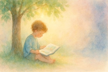
Watercolors are perfect for bedtime stories, fairy tales, and gentle adventures. Their transparency gives each scene a sense of warmth and calm that helps children feel secure.
In a world where overstimulation is everywhere, a watercolor storybook feels like a breath of soft and pastel air.
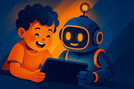
Digital art is everywhere in modern publishing, and yes, for good reason. It allows illustrators to play with clean lines, vivid colors, and dynamic textures while keeping production smooth and adaptable for print and screen alike.
Books like “Dragons Love Tacos” and “The Day the Crayons Quit” show how digital illustration can be playful, bold, and endlessly expressive. The latter even mimics crayon drawings, combining childlike creativity with professional polish.
Digital art works especially well for educational and interactive books, the kind that later morph into apps, audiobooks, or animated shorts. It’s also ideal if your book illustration service needs consistent branding across platforms.
Eric Carle’s “The Very Hungry Caterpillar” is the gold standard here. Collage combines cut-out textures, papers, or photos to create layered, tactile illustrations that feel alive.
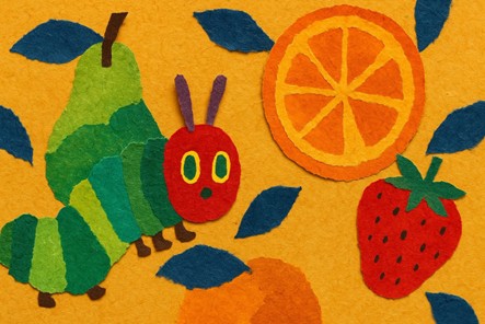
For children, this style has a special charm; it looks like something they could make with scissors and glue. That creative “I can do this too!” feeling makes stories more participatory and inspiring.
Collage or mixed-media children’s book illustrations are great for stories about discovery, creativity, and nature, anything that invites curiosity and hands-on imagination.
Cartoon-style illustrations use exaggeration, like big eyes, funny faces, and elastic movements, to capture emotion instantly. This is where laughter and empathy meet.
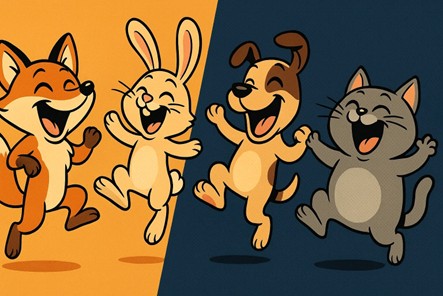
“Think of Don’t Let the Pigeon Drive the Bus!” by Mo Willems or “Dog Man” by Dav Pilkey. These stories rely on visual humor and body language to pull children in. For young readers, cartoon art simplifies emotions so they can understand feelings like anger, joy, or confusion just by looking.
If your story leans into humor, mischief, or adventure, cartoon styles bring characters to life in a way that words alone never could.
Sometimes, less really is more. Books like “Goodnight Moon” or “Brown Bear, Brown Bear,” “What Do You See?” show how simple shapes and repetition can be powerful for toddlers.
Flat design, with its clean edges and uncluttered scenes, helps young children focus on objects, colors, and rhythm, key parts of early learning. It’s also best for board books and early literacy projects, where clarity and repetition are important.
Some stories need to feel grounded, like historical tales, cultural retellings, or character-driven adventures.
Maurice Sendak’s “Where the Wild Things Are” balances imaginative monsters with expressive realism, creating a believable world that’s both wild and safe. Painterly styles draw children into the scene, encouraging them to explore and reflect.
This approach also works beautifully for middle-grade picture books, where slightly older children crave more depth and detail.
Retro art with its muted palettes, hand-drawn textures, and classic typography, is making a big comeback. It feels familiar, comforting, and timeless.
Books like “The Snowy Day” by Ezra Jack Keats used this aesthetic decades ago, and it still connects with today’s kids. Retro or mid-century styles often bridge generations, appealing to both the parent reading and the child listening.
It’s the perfect choice for stories that honor tradition, family, or memory, or for authors who want to stand out with a touch of authenticity.
Every illustrator knows a child’s first connection with a story isn’t through words, it’s through feeling. Before a young reader understands plot or character, they sense emotion through color, light, and movement. That’s the power of children's book illustration. It shows the story and translates emotion into imagery.
Think of the way a warm orange glow in “Goodnight Moon” makes bedtime feel safe and cozy. Or how the spinning greens and blues of “Where the Wild Things Are” create that mix of adventure and fear. The pictures are emotional signals, a visual melody that tells kids how to feel about what they’re seeing.
Children’s brains respond to visuals faster than adults’ do. In fact, kids recognize emotional expressions and colors quickly, long before words register meaning. That’s why a frown or a gloomy blue background can instantly tell them, “Something’s wrong,” even before the story says so.
Illustrations give children emotional context, helping them interpret complex feelings like fear, sadness, pride, and empathy in safe, visual ways. That’s how books quietly build emotional literacy.
When an illustrator exaggerates facial expressions or paints a storm cloud in an unusual way, they’re teaching children how to read emotions in the world around them.
Take “The Very Hungry Caterpillar.” It’s warm, textured collage style radiates curiosity and growth. The colors evolve page by page, from deep greens to vibrant reds, mirroring the caterpillar’s transformation.
Now think of “The Gruffalo.” Its digital-painterly art balances warmth with suspense, and friendly animals contrast it against a dark and mysterious forest. It’s exciting but never terrifying, because the illustrator knows exactly how much darkness a child can handle before curiosity turns into fear.
In both examples, the art guides emotion. The words may tell the story, but the visuals let kids feel it.
Illustration isn’t just about emotion; it’s also about pacing. When illustrations flow naturally with the text, the reader doesn’t just “see” a story, but they move through it. That rhythm can make a book soothing (perfect for bedtime) or thrilling (ideal for adventure tales).
That’s why collaboration between author and illustrator is vital; a mismatch in pacing or visual tone can completely change how a child experiences the story.
Children remember emotion long after they forget the details. That’s why the best picture books stay with them into adulthood, not just because of what they said, but because of how they felt.
Illustrations imprint color and shape onto memory in a way words rarely can. Ask any adult about their favorite childhood book, and chances are they’ll describe an image, not a sentence.
That’s the USP of illustration styles. They don’t just adorn a story, but they become the emotional memory of it.
Most first-time authors forget that you don’t choose your illustration style, but your story does.
Every children’s story has a rhythm, tone, and mood that demands a certain visual personality. And the right art style amplifies that personality. The wrong one drowns it out.
So before hiring an illustrator or browsing portfolios, ask: What feeling do I want this story to leave behind? Because in children's book illustration, the feeling is everything.
The age of your audience dictates how complex or simple your visuals should be.
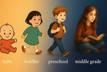
Babies and toddlers respond best to high-contrast colors, large shapes, and repetition. Books like Brown Bear, Brown Bear, What Do You See? or Dear Zoo use flat design and bold colors to stimulate developing eyes. Too much detail confuses them.
This is the perfect space for cartoon styles, watercolor whimsy, and bright, expressive characters. Kids at this stage want energy and empathy.
Slightly more detail and structure appear here. Books might shift toward digital or semi-realistic art, like Magic Tree House or The BFG. The aim here is to make them feel “grown-up” without losing warmth.
These lean closer to comic book illustrator territory, like sharper lines, moodier tones, and cinematic scenes. These readers crave drama and identity.
Every story gives off emotional “weather.” Illustration must reflect it.
Let’s imagine two books:
One is a gentle bedtime story about moonlight and dreams. And the other is a chaotic, laugh-out-loud story about a talking sandwich.
Now ask yourself: would you draw both in the same style? Of course not.
The first might call for soft watercolors or pencil shading, but the second should have wild cartoon energy, bright splashes of color, and bold fonts.
Your visual tone should represent your narrative tone.
Certain themes naturally pair with certain looks:
Each visual style carries symbolic weight.
Color choice is more about behavioral science.
Did you know that color significantly affects mood and memory in children? Warm colors stimulate energy, while cool tones promote calm focus.
That’s why vibrant red and yellow dominate early-learning books (excitement and attention), while soft blues and purples soothe at bedtime.
For example,
Remember, not all art styles cost the same.
Highly detailed painterly work or complex digital shading requires more time and budget. Simple line art or cartoon-based books are faster and often more affordable for first-time authors.
That doesn’t mean cheaper is worse. It means you need to balance vision with practicality. A minimalist flat style can look stunning if it fits the story.
If you’re hiring a book illustration service , communicate your budget early, but stay open to creative suggestions. Often, a professional illustrator can help you find a visual direction that’s both expressive and cost-effective.
Some of the best lessons come from books that have already nailed their match between story and style:
Each one chose an illustration that felt inevitable once you saw it.
When you strip it all down, your goal isn’t to pick a “pretty” style; it’s to pick the one that feels like your story.
In kids' book illustration , your visuals should make the child feel something even before the first sentence is read aloud.
When it comes to children’s books, art is about making something feel alive.
Every brushstroke, color choice, and curve of a smile carries emotional weight. The best children book illustration doesn’t just tell kids what’s happening, it helps them understand it, feel it, and sometimes, even heal through it.
Because the truth is, children don’t remember every line of text, but they never forget the way a picture made them feel.
That’s why the illustration style you choose is your story’s emotional compass. And we always recommend going to a professional book illustration service .
And if you are searching for one, we at 360 Illustration have an expert team of illustrators, designers, and storytellers who collaborate closely with authors to find the perfect look for each story, whether that means dreamy watercolor worlds, fanciful cartoon styles, modern digital storytelling, or hand-drawn art.
We don’t just draw what you write, we listen to what your story feels like.
Don’t wait, start your journey with us today, and let us give your story the visual soul it deserves.
Looking for more information? Call us at +1 (855) 521-5040 for quick support!


Have a project in mind? Reach out to us, and we’ll help turn your ideas into stunning illustrations.
Tell us what you need, and we’ll create a custom illustration just for you. Reach out today and let's get started!

Copyright © 2026 360 Illustration House | All rights reserved. Terms And Conditions | Privacy Policy | Refund Policy
